There’s a version of coastal design that most people picture immediately. Soft blues, white shiplap, a scattering of shells on the windowsill. It photographs well. But living in it? That’s another story.
The best coastal homes don’t announce themselves. They feel like the coast. Walk in and the air seems lighter, the palette reads like a quiet morning by the water, and every surface invites you to stay. That feeling comes down to the coastal colour schemes, materials, and finishes chosen during design, well before any paint hits a wall.
This guide walks through the palettes, finishes, and design thinking that separate a considered coastal home from one that just borrowed the mood board.
What defines a coastal colour scheme in a modern beach home
Coastal colour schemes have shifted significantly. The stark white walls and bright navy accents that defined the beach house look for decades are giving way to something warmer, earthier, and more grounded. Cool greys have faded. Warm whites, sandy taupes, and muted greens are taking their place.
The core principle hasn’t changed. A coastal colour scheme draws directly from the shoreline: sand, sea, sky, driftwood, stone, and shell. What’s different is how those tones are applied. Rather than bold contrasts between white walls and a statement blue feature, the approach now leans into tonal layering. Variations of the same warm neutral flow from room to room, with depth coming from texture rather than colour.
James Hardie’s 2026 Modern Coastal Forecast captures the shift. The palette has moved from airy light tones to warm pastels, chalky matte finishes, and earthy neutrals that bring warmth into a home without weighing it down.
Three to five colours is the sweet spot. Start with a warm neutral base, layer in two or three accents pulled from the landscape around your home, and keep matte or satin finishes over gloss. That combination catches natural light beautifully and ages well in the intense Australian sun.
The four coastal palettes shaping luxury beach homes
Not every coastal colour scheme looks the same, and it shouldn’t. Your palette should reflect the specific coastline you’re building on. A canal-front home in Mandurah sits in a different light and landscape to a beachfront in Byron. The best starting point is to look at the colours you actually see outside your window.
Four broad palette families are driving most of the conversation right now.
Warm whites and layered neutrals
This is the backbone of most modern coastal colour schemes. Warm whites with beige, cream, or sandy undertones replace the crisp, cold whites that dominated for years. Colours like Dulux White Exchange Half or Colorbond Surfmist sit in this family, and they work because they reflect light without the glare that stark whites create in WA’s strong sun.
The trick is layering several tones of warm white across walls, ceilings, joinery, and trim. The shifts are subtle, but they prevent the space from reading flat. Let texture do the heavy lifting through stone, linen, and timber rather than colour contrast.
Sandy neutrals and driftwood tones
Pale sand, warm beige, greige, mushroom, taupe, and weathered grey-brown. These colours mirror the shoreline and aged timber, and they’ve become the 2026 answer to the beige palettes of the early 2000s. The difference is depth. Today’s versions have warm undertones and subtle complexity rather than feeling washed out.
Driftwood palettes work beautifully through tonal blending, where different shades of sand, stone, and weathered grey layer across surfaces and furniture. It’s the kind of palette that makes a home feel collected over time, even when it’s brand new.
Ocean blues and sea glass greens
Blues remain the signature of coastal colour schemes, but the way they’re used has evolved. Soft powder blues still work for an airy, open feel. Seafoam and sea glass greens add a fresher, more contemporary layer. And for homes that want more presence, deeper tones like navy, slate, and ink bring what designers are calling a ‘moody coastal’ palette.
The shift toward deeper, more architectural blues is one of the stronger 2026 trends. These are crisper and more confident than traditional coastal blues, and they pair well with stone, metal, and strong architectural lines. Used on kitchen joinery or a bathroom vanity, they anchor a space without overwhelming it.
Sage, eucalyptus, and earthy accents
Muted sage and eucalyptus green have become the breakout accent colours for coastal interiors. They connect to the native Australian landscape, sit comfortably alongside sandy neutrals and warm whites, and feel fresh without being trendy. Australian designers are calling it a heritage revival, inspired by the greens of the bush rather than the sea.
For bolder moments, deep forest greens, warm charcoals, and rich terracotta are being layered into otherwise neutral rooms. The old rule that everything needed to be light and airy no longer holds. A dark-stained walnut island bench or a moody charcoal feature wall adds weight and sophistication that softer palettes can’t deliver alone.
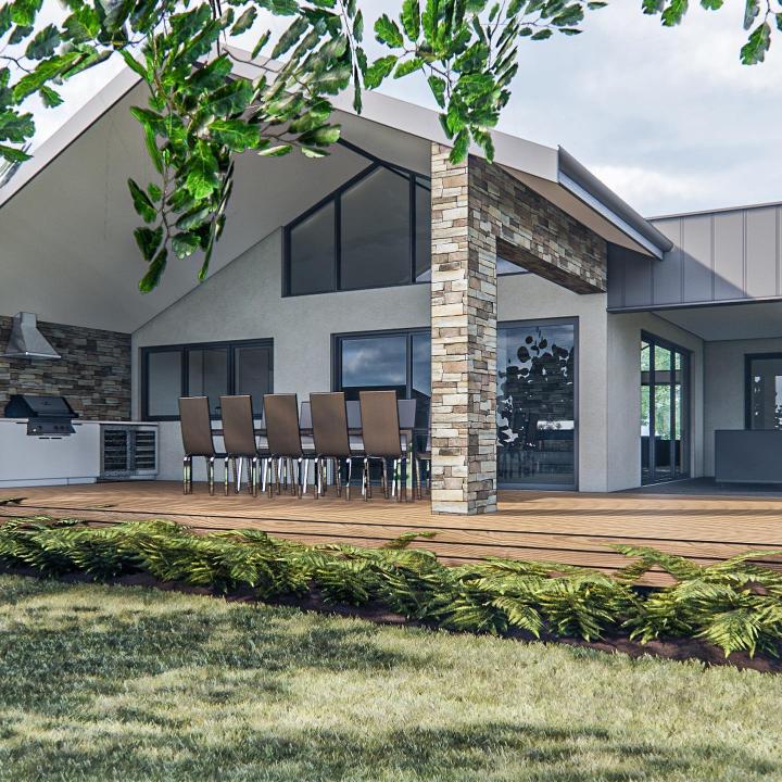
How natural materials bring coastal colour schemes to life
In a home where the palette stays tonal and restrained, texture becomes everything. Two rooms can use the same colour range and feel completely different depending on the materials in play.
Timber with weight and warmth
Timber carries warmth that paint alone can’t replicate. Light oak, whitewashed timber, and bleached driftwood tones still work well in lighter schemes, but 2026 is bringing darker, richer woods back into coastal spaces. Walnut, warm European oak, and mahogany-stained finishes add weight and sophistication, particularly in kitchens and living rooms. If you’re exploring how luxury home flooring trends intersect with a coastal palette, timber and stone-look tiles are leading the way.
Stone that suits the coastline
Stone is the other anchor material. Travertine, limestone, and sandstone tie a home to its landscape in a way manufactured finishes rarely achieve. For coastal WA, porcelain tiles that replicate natural stone offer the same visual warmth with better resistance to salt air and moisture. Mandurah-based tile specialists note that large-format stone-look porcelain is one of the most consistent requests for coastal builds.
Linen. rattan, and natural fibres
Washed linen upholstery and bedding, jute and sisal rugs, rattan pendants, and woven cane cabinetry details bring the organic imperfection that signals quality. These aren’t decorations. They’re the textural layer that stops a neutral palette from reading as bland.
Limewash and textured walls
Flat paint on plasterboard is giving way to limewash, Venetian plaster, and microcement finishes that add soft, mottled depth to walls. These mineral-based finishes are breathable and durable in humid coastal climates, and they catch natural light in ways flat paint can’t. In a tonal coastal colour scheme, the walls themselves become a feature.
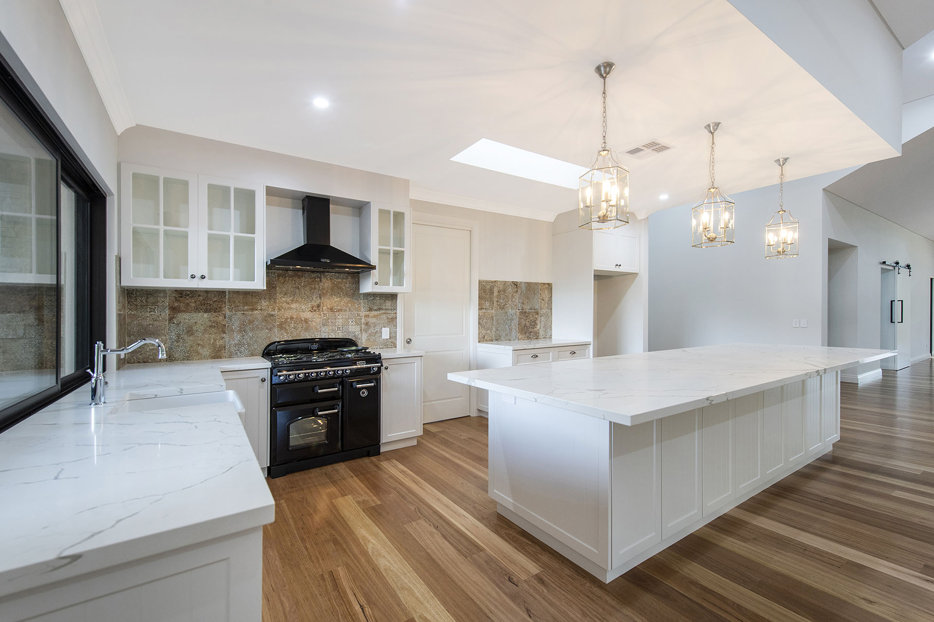
Kitchen colour schemes for coastal homes
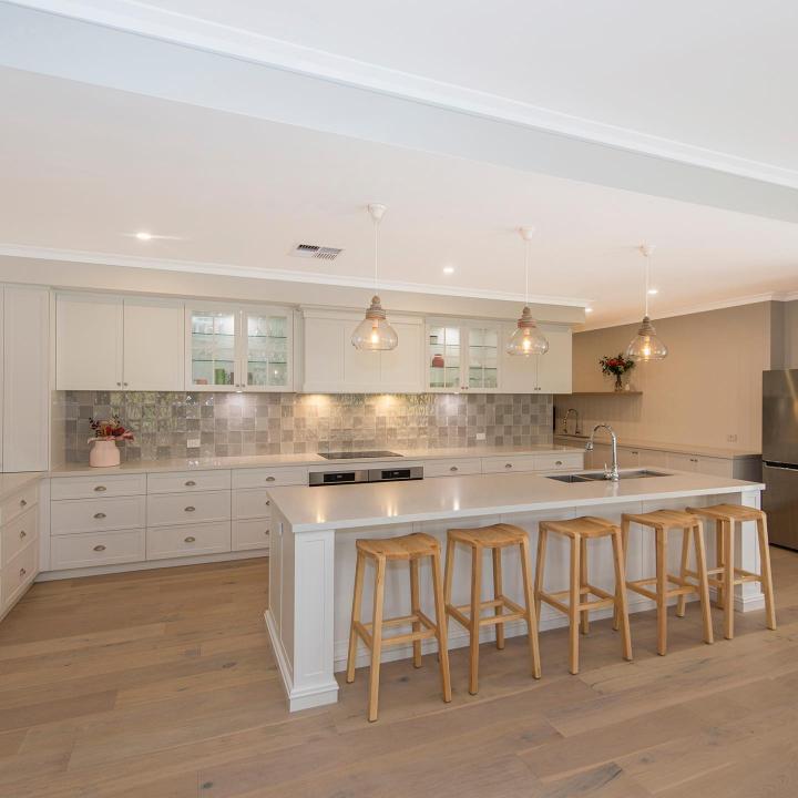
The kitchen is where coastal colour schemes face their toughest test. It needs to look beautiful, handle daily use, and resist the salt air, humidity, and UV that come with living near the water. The trend in luxury coastal kitchens is moving toward ‘quiet luxury’: clean joinery lines, natural stone benchtops, warm metallic hardware, and everything functional hidden behind seamless cabinetry.
Warm whites and natural oak
Warm white 2pac cabinetry paired with blonde oak joinery details, a veined marble or quartzite benchtop, and brushed brass tapware creates a kitchen that feels refined without being cold. For more depth, a two-tone approach with lighter uppers and darker lowers (muted navy, sage green, or soft charcoal) adds visual weight and stops the space looking flat.
Sage and eucalyptus green
Muted sage and eucalyptus green cabinetry is one of the more distinctive 2026 choices. Laminex’s Seed finish pairs eucalyptus-toned cabinetry with ivory marble benchtops and timber floors for a look that’s distinctly Australian. It works particularly well in kitchens surrounded by native garden views.
Benchtops that handle the beach
Benchtop selection deserves careful thought. White Oak marble in a honed finish has become a go-to for luxury coastal kitchens because its natural linear grain mimics fine timber while delivering the resilience of stone. Quartzite is another strong option, offering marble’s visual appeal with better scratch, heat, and stain resistance. For homes where tracked-in sand is a daily reality, honed and matte finishes hide micro-scratches far better than polished surfaces.
Hardware that gets better with age
Hardware finishes play a bigger role than most people expect. Unlacquered brass is one of the most sought-after finishes in luxury coastal design. It’s a ‘living finish‘ that naturally develops a soft patina over time, adding character that feels authentic rather than manufactured. Polished nickel brings a warmer, more luminous silver tone compared to chrome and pairs beautifully with stone and painted cabinetry. For the most curated look, mix two or three complementary metals across cabinetry, plumbing, and lighting rather than matching everything to one finish.
For a deeper look at luxury coastal kitchens, 10 luxury kitchen design ideas to elevate your home covers everything from stone selection to integrated appliances.
Bathroom finishes that feel coastal, not themed
A coastal bathroom should feel like a quiet retreat. The 2026 direction is toward earthy palettes, natural stone, and finishes that age gracefully rather than fighting the environment.
Travertine and limestone are the natural stone heroes here. Their warm, varied tones echo the shoreline, and honed or tumbled finishes feel organic underfoot. In Mandurah’s coastal environment, porcelain stone-look tiles offer the same warmth with better moisture resistance.
Colour palettes are leaning warmer. Pale clay, soft ochre, and muted beige are replacing the cool whites that were standard for years. Soft blue or sea glass green tile still works in smaller doses, but the foundation should feel warm and grounding.
Large-format tiles dominate because fewer grout lines mean easier maintenance and a cleaner visual flow. Matte and honed finishes outperform polished surfaces because they soften light rather than reflecting it. Carry the same metallic language from the kitchen into the bathroom, whether that’s unlacquered brass, polished nickel, or satin bronze.
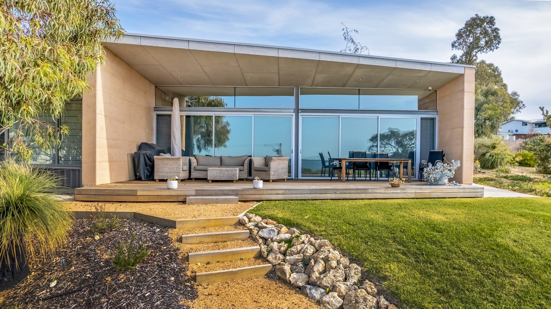
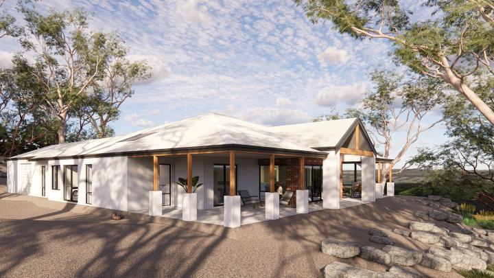
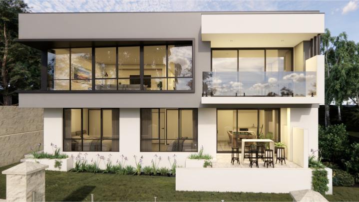
Exterior coastal colour schemes for Australian beach houses
Your exterior palette needs to work twice as hard as your interior. It has to look good from the street, complement the landscape, handle relentless UV and salt exposure, and still feel connected to the interiors when you open the front door.
The dominant trend across Australian exteriors is a shift from cool greys toward warmer earthy tones. Sandy beiges, terracotta, warm clay, and muted greens are replacing the stark whites and cool greys that defined the last decade.
Hamptons-inspired schemes remain popular. Colorbond Surfmist roofing with warm white weatherboard cladding, natural stone accents, and blonde timber entry details creates a clean, bright facade without the glare of stark white. For a warmer, more grounded feel, Colorbond Dune or Paperbark on the roof with sandy render and spotted gum or blackbutt timber detailing blends into the coastal landscape rather than sitting on top of it.
Material choices matter as much as colour. Horizontal fibre cement weatherboard (such as James Hardie Linea or Stria) handles salt air, UV, and moisture far better than traditional timber cladding. For homes within one kilometre of breaking surf or 100 metres of canals, Colorbond Ultra carries enhanced corrosion resistance that standard Colorbond won’t match. And within the coastal zone, 316 marine-grade stainless steel is the baseline spec for any exposed metal.
How light and orientation shape your colour choices
One of the most common mistakes in coastal colour selection is choosing a colour in a showroom and assuming it will look the same at home. Australian light is among the strongest in the world, and it changes how every colour behaves.
Room orientation plays a decisive role. North-facing rooms receive the strongest sunlight, so colours appear more intense. Cooler tones like soft blues and muted greens balance the brightness without dulling the room. South-facing rooms get less direct light, so warm off-whites and gentle creams prevent the space from feeling cold. West-facing rooms catch the full force of WA’s afternoon sun, where cooler tones offset the glare rather than amplifying it.
The practical lesson? Always sample on-site. Paint a swatch on each wall and view it in the morning, at midday, and in the evening. A warm white that looks perfect at 9 am can shift to cream or soft pink by 4 pm when the western sun hits. This is particularly relevant in Mandurah’s canal-front homes, where reflected light off water intensifies the effect. Matte and low-sheen finishes diffuse light more evenly than gloss, making them the better choice for walls and ceilings in a coastal home.
Balancing luxury with relaxed coastal living
A luxury coastal home needs to feel polished and considered, but never stiff. Relaxed and liveable, but never sloppy.
The most refined coastal homes evoke the coast through palette, stone, timber, and light rather than nautical motifs or themed accessories. What creates character is the contrast between casual and refined: a linen slipcovered sofa next to a polished travertine table, a woven rattan pendant over a marble island, jute underfoot with brushed brass at hand height. 10 luxury home design trends explores how this interplay works across different areas of the home.
Visible timber grain, variegated stone veining, and the soft patina on an unlacquered brass handle aren’t flaws. They’re markers of quality. The finishes should support life by the water too: honed stone over polished, performance fabrics on the sofas, matte cabinetry over gloss. When the finishes work with the lifestyle, the home stays beautiful without requiring everyone to tiptoe around it.
How D.A. Burke approaches coastal colour and design
If you’ve been reading through these ideas and thinking about how they could work on your block, that’s exactly the kind of conversation we have with families every week here at DA Burke.
We’re a family-owned custom home builder based in Mandurah with over 40 years of experience across three generations. We’ve built homes across the Peel Region, from canal-front properties in Wannanup and Dawesville to rural builds in North Dandalup and Waroona, and we understand the material demands of this coastline because we’ve been building on it for decades.
Every project starts with a genuine conversation about how your family lives and what the block demands. We provide fixed-price contracts with guaranteed completion dates and 24/7 project access through our online portal, so the colour and finish selections you make during design are the ones you see on handover. No shortcuts, no surprises.
Ready to explore what a luxury coastal home could look like for your family? Get in touch with our team for a no-obligation consultation. You can also browse our completed projects or explore our luxury home designs to see how we bring these ideas to life.
Coastal colour schemes are the foundation, not the finish
A considered coastal home doesn’t start with a paint colour. It starts with understanding your block, the light that moves across it, the environment your materials will endure, and the way your family wants to live. The coastal colour schemes, finishes, and materials flow from those decisions.
Get them right, and the home feels effortless. The palette belongs in the landscape. The materials age with grace. The rooms are calm and generous, warm and welcoming, and they work just as well on a Tuesday morning as they do when you’re entertaining on a Saturday night.
If you’re thinking about building a coastal home in Mandurah or the Peel Region, start a conversation with D.A. Burke.
Frequently asked questions
What colours work best for a coastal colour scheme in WA?
Warm whites with beige or cream undertones, sandy neutrals, and muted sage greens are the most versatile foundation. Avoid stark cool whites, which read as harsh in WA’s intense sunlight. Layer in soft blues, driftwood greys, or deeper navy for depth, and always test colours on-site at different times of day.
Can I use dark colours in a coastal home?
Yes, and increasingly, designers are. Deep charcoals, moody navy, forest greens, and rich walnut tones bring sophisticated contrast to a coastal colour scheme. Use them on joinery, feature walls, or furniture rather than across entire rooms, and pair with warm neutrals and natural light. In Mandurah’s canal-front homes, darker interiors let the water views provide the colour.
What exterior finishes hold up best in coastal conditions?
Fibre cement weatherboard (such as James Hardie Linea or Stria) outperforms traditional timber in salt and UV resistance. Colorbond Ultra roofing is essential within one kilometre of surf or 100 metres of canals. All exposed fixings should be 316 marine-grade stainless steel. Lighter colours with warm undertones, like Colorbond Surfmist, reflect heat and resist UV fading better than darker tones.
What metallic finishes work best in salt air?
Unlacquered brass develops a warm patina over time that suits coastal interiors. Polished nickel offers a warmer alternative to chrome. Satin bronze and brushed gold bring warmth without excessive shine. The critical factor in coastal WA is ensuring exposed metal is rated for marine environments, with 316 marine-grade stainless steel as the baseline for structural fixings and PVD-coated finishes for decorative metals.